11.04.2022: EXCITING EXCURSION INTO DATA
HOW DATA VISUALIZATION INFLUENCES OUR BRAIN
“A picture is worth a thousand words.”
Everyone is probably familiar with this statement. In our case, it would perhaps be better translated as “A visualization says more than a thousand numbers in a table.” In this blog post, we want to take a closer look at how data visualization is related to human information processing – more specifically, our visual attention.
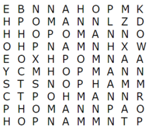
The fact is that our brain is not designed to quickly and accurately find a target object in the midst of objects with similar characteristics. Let’s look at an example: Can you find the word “HOPMANN” in this grid?

We’re sure you were able to find it, which is fantastic, but it took time and effort.
This is because our brain cannot process all the information at the same time. Our attention determines which information is relevant and will be processed, but also which is irrelevant and therefore negligible. In our example, the letters H, O and P can be classified as relevant, while the letters E or X are irrelevant. However, as letters do not differ too much from each other, they all have to be looked at one after the other, which takes a lot of time. If you don’t have this time, e.g. if I only give you 2 seconds for a puzzle, you may overlook the word or make mistakes. Don’t worry, it’s not up to you, it’s human nature!
But what if we add some color to the grid?

This time I’m sure you found the word “HOPMANN” in a flash. By changing an elementary feature such as color, our attention is directed and the target object catches the eye. This is also known as the “pop-out effect”. Other visual features such as shape, size, rotation or context can also be used for this purpose. The critical problem is that if too many of these features are used, our attention is drawn in all directions, which in turn has no added value and is ultimately no better than no visual aid.
If word search puzzles were part of an analyst’s job description, we could stop here, but it gets even more complicated. A company collects a lot of data these days and not all of it is relevant. Once you have sorted out irrelevant data, you have to visualize the data in a way that makes it interpretable. You don’t just want to understand the data, you also want to draw conclusions from it, recognize trends and derive decisions. Different brain regions for memory or decision-making, for example, work together in a complex way.
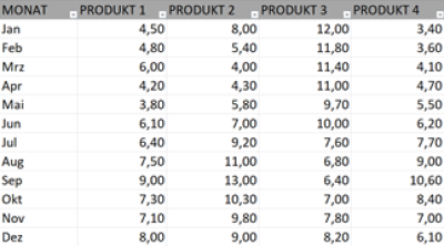
Let’s take a look at this table for 10 seconds:

Aside from the fact that the table shows sales figures for 4 products over a 12 month period, it’s difficult to fully capture any interesting patterns or trends in the data.
But what if we visualize this data ANYWAY?

Even though product 2 has been nicely highlighted with color to draw our attention to it, it is difficult to interpret the data.
Let’s try it another way.

This way, 10 seconds is enough to not only get a clear idea of the data, but also to answer a deeper question (Which product should we focus on in the future?). Don’t get us wrong, it is by no means easy to present complex information simply! However, we data analysts and visualizers have made this our goal in order to drive companies forward better and faster.
Let’s summarize everything again at the end: The human brain is not designed to process objects with similar characteristics to a table of data quickly and flawlessly. Visualizations can help to direct our attention in certain directions and to understand information with little effort. The interpretation of the information is in turn strongly influenced by the choice of visualization type.
So the next time you fill your reports to the brim with data tables, remember the importance of data visualization and start presenting those numbers in a suitable graphic. We are sure that at least one person will thank you for it.
